We evolve to be better
More than 20 years on a journey full of experiences, new challenges and projects have brought us to a more digital environment. This requires us to evolve to better communicate who we already are – an aeronautical consulting company that is more technological and versatile than ever.
A new horizon
Our environment has evolved, and we have evolved with it. We are veering into a modern brand image, with greater impact, that is easier to recognise and remember. We’re changing our corporate identity, but our brand remains the same. The values and personality that brought us to this point, remain intact.

Logo
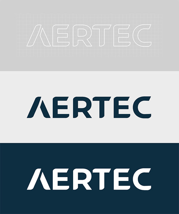
The geometry and aerodynamics of aeronautics are the sources of our inspiration. The subtle graphic adjustment in the letter A emphasises the spirit of aeronautics, enhances its vector shape and subtly suggests a plane’s contrail using an upward (and positive) diagonal. The capitalised typeface makes the entire logo more stable, thus making it easier to read and remember.
The shape of the letter A can also stand alone, while maintaining the visual power to meet all kinds of graphic needs (lettering on buildings, social networks, stamps, pins, etc.).

Colour range
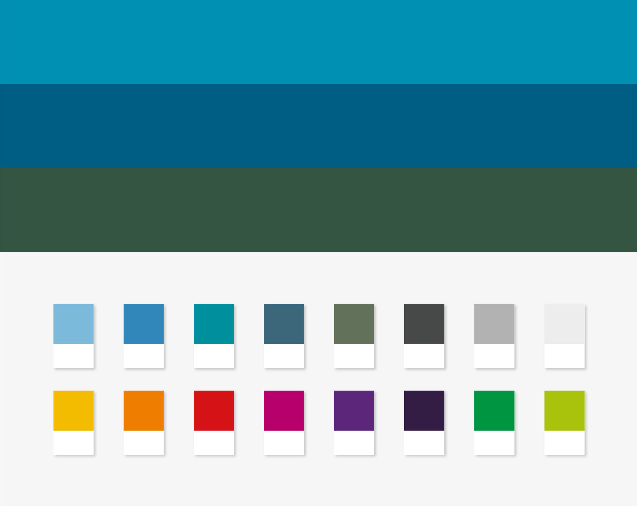
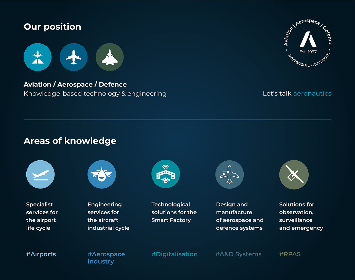
The colour range represents the aeronautics industry, with a cold colour palette for our logo, sectors we serve and areas of expertise. These colours lead the way to warmer and neutral complementary tones.

Typography
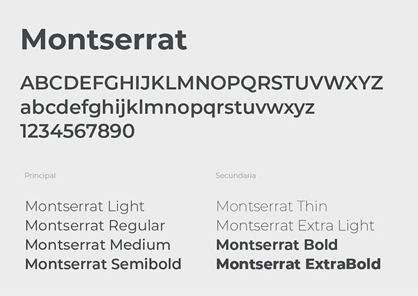
The Montserrat typeface is a sans serif font with multiple versions, which offers broad possibilities for both the online and offline world. It is a modern, geometric and highly readable typeface family, designed by Julieta Ulanovsky under a free license in open source SIL Open Font, available for both Mac and PC.

Do you have one minute?
In just 60 seconds, discover our new corporate identity – and join us on this exciting journey!
